When Ukrainian designer Anton Suprunenko first saw the Pepsi website, he wondered why one of the most recognizable brands in the world uses such outdated designs.
With 15 years of experience working with European, Australian and American companies, Suprunenko thought that, just for fun, he could help Pepsi rebrand itself.
JOIN US ON TELEGRAM
Follow our coverage of the war on the @Kyivpost_official.
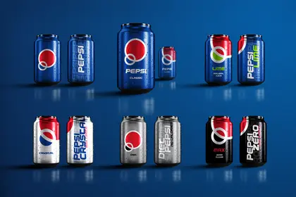
He did just that and got famous. For his concept redesign of the Pepsi logo, packaging, mobile application and website, Suprunenko won the prestigious Red Dot Design Award, dubbed the Oscar for designers. Over 10,000 companies apply to the Red Dot competition every year, but only 3% receive an award.
Even though Pepsi couldn’t use Suprunenko’s designs, the company liked the concept and invited the Ukrainian to its New York office to discuss how they could work together in the future.

According to Suprunenko, modern design should be simple but meaningful. In his concept, he used two intertwined circles that form a letter P and look like bubbles and planets to show that Pepsi is a popular beverage all over the world.
“The essence of the Pepsi brand is to be modern and fashionable — it always keeps pace with the times,” Suprunenko told the Kyiv Post. Pepsi’s current logo, designed back in 2014, appeared to him visually obsolete.
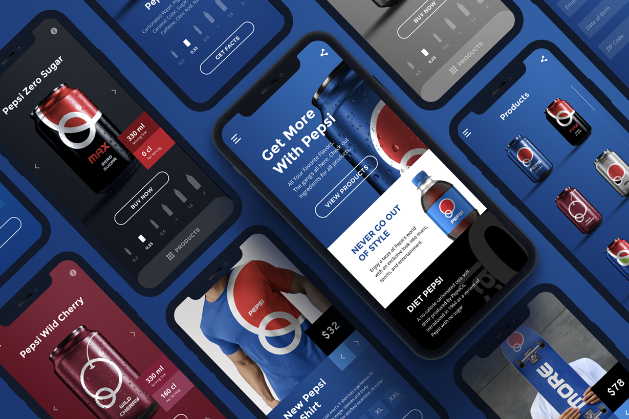
Suprunenko also added new features and colors to the company’s app and website. For example, in his concept, the color of the web page depends on the flavor of Pepsi: blue is for classic, red is for cherry, black — for zero sugar.
Pepsi can take advantage of its diversity of tastes and colors to compete with another famous soft drink producer, Coca Cola, which is much more traditional, Suprunenko said.
Suprunenko isn’t the only Ukrainian who received a Red Dot award in 2020. Ukrainian mobile bank Monobank and the Diia website for government electronic services — designed jointly by marketing agency Fedoriv and design bureau Spiilka — each got an award, too.
Monobank was recognized for the best mobile app design among financial companies, while Diia received an award for how its website works.
Now, the German Red Dot Design Museum — one of the world’s most prestigious for contemporary designers — will feature Ukraine’s government e-service site among other winners, Digital Transformation Minister Mykhailo Fedorov said on Facebook.
You can also highlight the text and press Ctrl + Enter


